
So you’ve read the primer post here ‘The training spreadsheet, part 1‘ and now your ready for some fun stuff, plugging real life data in and doing some fun charts and tables. Yeah fun with spreadsheets, that is what I’m talking about. Just as a re-cap, the spreadsheet I’m using is here: http://goo.gl/Msd62O
Let’s jump straight into a pivot chart. I’m going to explain this with googledocs but it’s very similar in excel too. Pivot tables and charts are a way of having your spreadsheet aggregate, sum or analyse your data. It’s a way of saying ‘find me all the data that looks like this, and do this with it’. So how does it work with that list we created?
Let’s say we want to create a graph totalling all the running we’ll be doing every week. We probably want a table that looks like this, to make a nice graph:
[table]
Week, Minutes
1,50
2,85
3,120
4,135
5,150
6,165
7,210
8,240
9,270
10,300
[/table]
This is a table that puts the week numbers in rows, filters just the running activities and then sums the minutes. Let’s go!
- Select the data you want. You can either select or the columns, or in googledocs just click anywhere in your training plan.
- Go to ‘Data’ then ‘Pivot chart report’
Done! Ok not quite, but that is the hard part. What you’ll have is a blank pivot table in a new chart plus a ‘Report Editor’ on the right. This report editor is what we’ll use next. If at any time you cant see the report editor, just click anywhere in the pivot table and it reappears.
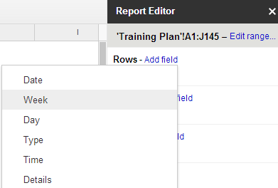
We said initially we wanted the week number in rows. So go to ‘Rows’ in the report editor and click ‘Add field’. Select week. This will populate all the week numbers in your chart.
Training Spreadsheet
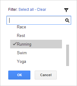
Next we said we wanted to filter it to just running. Because any good training plan has more than just running, right? So go down to ‘Filter’, click ‘Add field’ then select ‘Type’. Now on the filter box where it says ‘Show’ just select ‘Running’.
Training Spreadsheet
Last bit, we just need to populate some values. So go to the values option, add a field and select minutes. By default the pivot chart is going to now sum up all the minutes for running, and group it by week. You have your first pivot chart. Good, huh? You can thank me later, this will change your life. I think you might tell your grandchildren about this moment.
More complex stuff
So that was a very easy one, but you can see how easy it is to build up reports. Let’s quickly edit this one now, because we’re not just interested in running are we. No siree. We want to see every type of activity we’re doing over the weeks don’t we. In fact we probably want each activity in it’s own column, again with the weeks down the left. And obviously we want a chart too, don’t we?
Let’s add ‘Type’ into the columns part. Once you’ve done this go down to the filter and add ‘Cycling’ and ‘Swimming’ to your selected list. Boooom! you have now got a pivot table showing the activities you’ll be doing summed by type and grouped by week and with a total for each week.
Charts
To add a chart, highlight the first four columns, and go to ‘Insert’ then ‘Chart’. Pick the area one. Select ‘Use Row 1 as headers’ and ‘column a as labels’. Click insert. You are done. The graph looks like this (you should always set axis titles, unlike me here):
The best thing? If you change the values on your training plan, this graph will magically update automatically. Try it. So now we can do some charts, let’s look at how you might report on your progress next with ‘The training spreadsheet, part 3‘.
Hey!
the google sheet file no longer exists. Are you able to repost?
Thanks
Katie